
Yapı Kredi Private Banking Ankara
We are pleased to share with you the “Inner Aqua” art consultancy project we developed for the Yapı Kredi Ankara project.
This work encompasses the research, conceptual studies, and art placement proposals undertaken to develop an artistic approach that engages with the project’s architectural character, corporate identity, and spatial experience.
In this blog, you can find details regarding the starting points of the approach, the creation process of the series, and how it was adapted to the Yapı Kredi venues in Ankara.
Inner Aqua Art Series | Between Art and Architecture
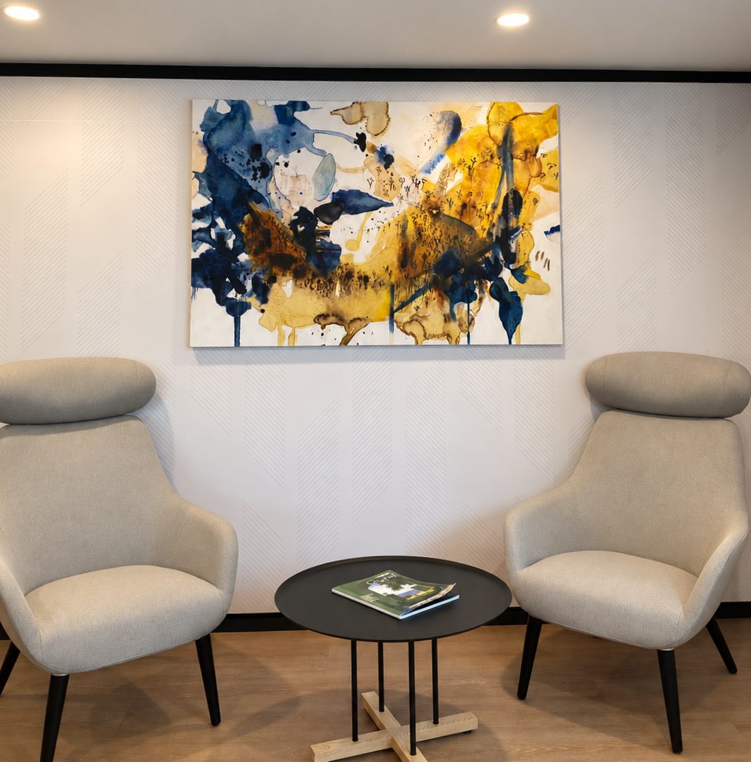
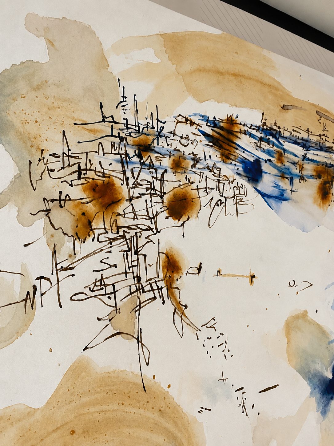
Inner Aqua is an art series inspired by the flow of water, its interaction with surfaces, and the traces it leaves over time. Through the concepts of Flow, Trace, and Layer, fluid forms, pigment movements, surface reactions, and overlapping layers shape the series’ visual language.
Traces That Find Their Resonance in the Space
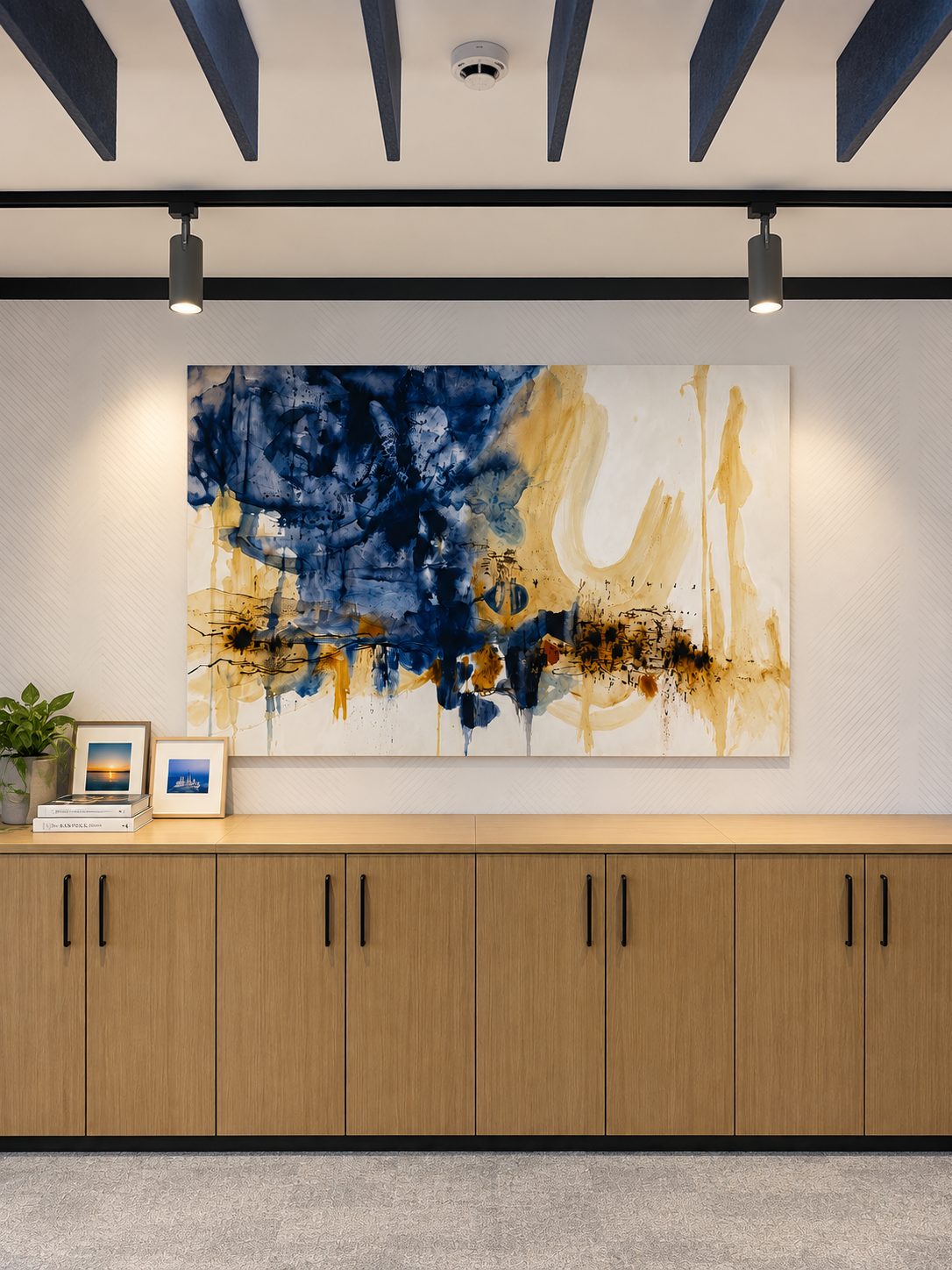
The atmosphere of the series is shaped through the interplay of light, color, texture, and material. Fluid forms, surface traces, and layered compositions constitute the series’ core visual language. The placement of the artworks throughout the project has been carefully curated in consideration of the architectural rhythm, wall scale, and circulation paths.
Encounters with Place
The artworks are designed to accompany users throughout their everyday experience of the space. While some pieces create strong visual focal points, others appear as quieter compositions waiting to be discovered. In this way, art becomes not a single moment of observation, but an experience unfolding through multiple encounters within the space.
Parts That Make Up a Whole
While maintaining their individual identities, the artworks establish a visual connection with one another through relationships of color, texture, and composition. This approach allows the artworks encountered throughout different areas of Yapı Kredi Ankara to be perceived not as independent pieces, but as different parts of the same story.


The Manifestation of Colors in Space
The navy blue, blue, and warm earthy tones used in Inner Aqua were carefully selected to complement Yapı Kredi Ankara’s corporate identity and existing spatial palette. While the blue tones evoke a sense of trust, calm, and focus, the warm hues bring energy and warmth to the space. This balance allows the artworks to create a strong yet controlled impact within the neutral workspaces.
Tracing Flow: An Abstract Process of Becoming
In Inner Aqua, abstraction is embraced to offer an experience open to diverse interpretations, rather than representing a specific object. In works created using water-based techniques, the spreading and accumulation of pigment, along with the traces left behind as it dries, shape the development of each composition. The way one mark follows, intersects with, or gives way to another creates a sense of flow and continuity within each artwork. As a result, the painting becomes more than a singular image; it transforms into a living surface that carries the traces of its own formation.
Diğer Projeler
ALAN Project